
Art’s Evolving Power in Public Health Campaigns
When economics and art join forces

Would you believe that the image below is a public health campaign poster? To paraphrase Seuss, you might …
Stand puzzling and puzzling—how can it be right?
It came without warnings! It came without fright!
No arrows! No hashtags! No germs magnified!
No “get your shot now” or “you could have died!”
What kind of a poster, so empty, so bland—
Could hope to inform with no helping hand?

Yes, this poster is indeed fulfilling the core focus of public health campaigns: improving access to information and changing behavior. While news bulletins or print documents sometimes fill that role, art like this can provide unique opportunities to draw in an audience. The use of art in public health has transformed over the last century, evolving with new health challenges along the way. Let’s take a short journey to learn how art changed from conveying specific information to spurring action through emotional influence, and back again….What if art, perhaps, means a little bit more?
Economics Meets the Canvas
Public health crises require changing behaviors on a population level. Two economic principles aid in changing population-level health behaviors:
1) Introducing information on a wide-scale on how disease is spread to encourage preventive behaviors
2) Helping people see how their actions lead to externalities, where individuals’ actions have an unintended effect on parties not involved in the behavior, then motivate individuals to account for these external effects.1
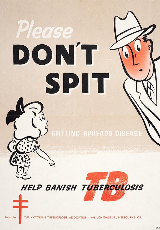
Consider this poster on preventing tuberculosis from Australia in 1961 which applies both principles. Plenty of words warn that spitting spreads disease and announce that chest x-rays to detect the disease are free (and mandatory). But notice the art also subtly employs a tactic to sway viewers to consider the externality of spitting in public by using a young girl as the messenger. She is unlikely to be a spitter, but equally susceptible to TB. The red-faced abashed spitter also chastises the viewer to feel ashamed for creating this externality.
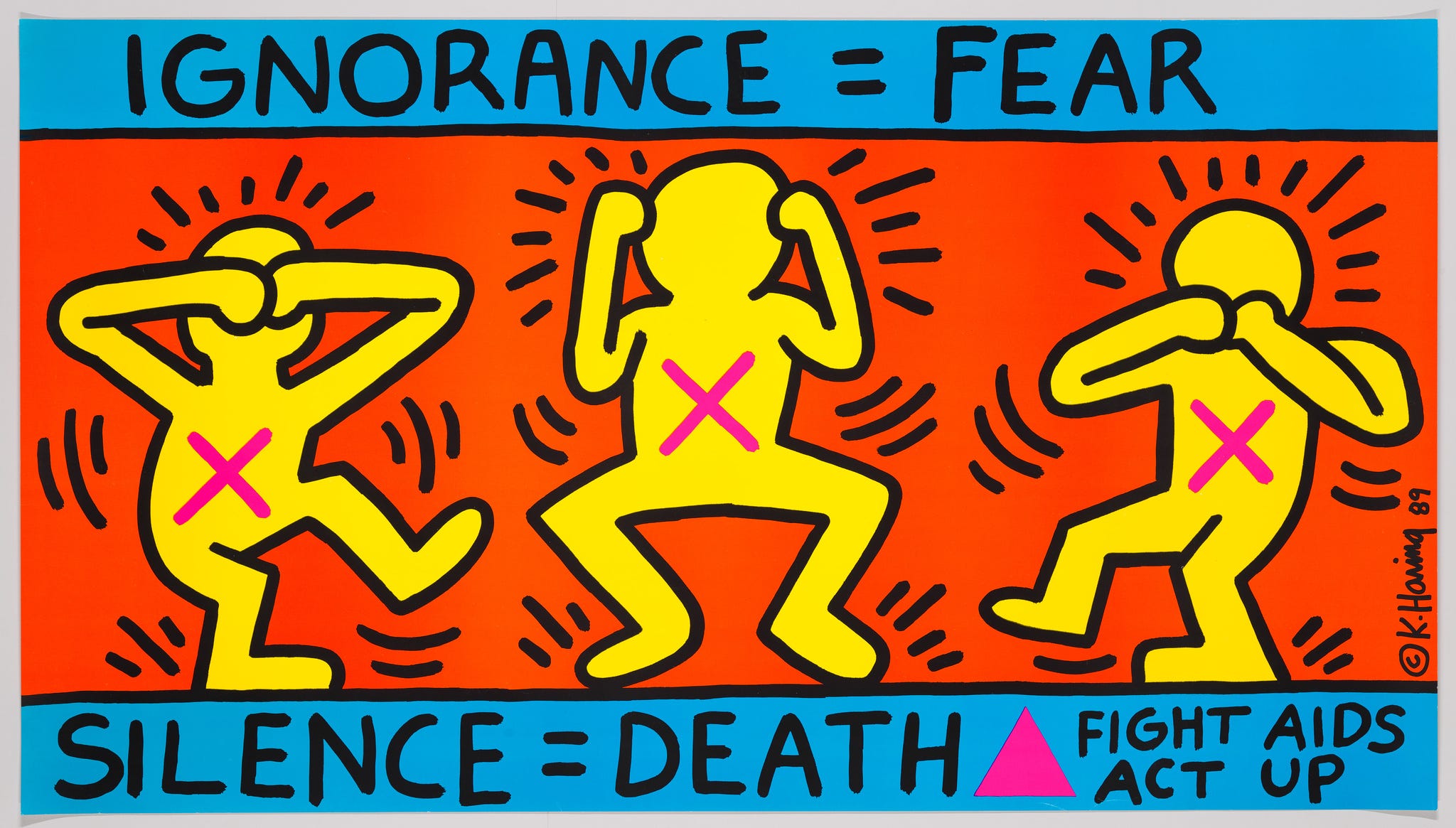
By the time of the HIV/AIDS epidemic in the 1980s and 90s, art in public campaigns had taken a dramatic turn, driven by the stigma surrounding the disease. Campaigns focused heavily on emotion and awareness. The most famous to champion the cause was artist Keith Haring, HIV-positive himself. Whereas the tuberculosis poster above stressed a specific preventive action, Haring’s art addressed general fears and misconceptions. The “Ignorance=Fear” image below confronts the uncomfortable information that transmission extended beyond the gay population by showing figures devoid of any age, gender, race, or sexuality. Though words are prominently displayed above and below the figures, the phrases call to engage, rather than detail specific prevention.
When Art and Economics Join Forces
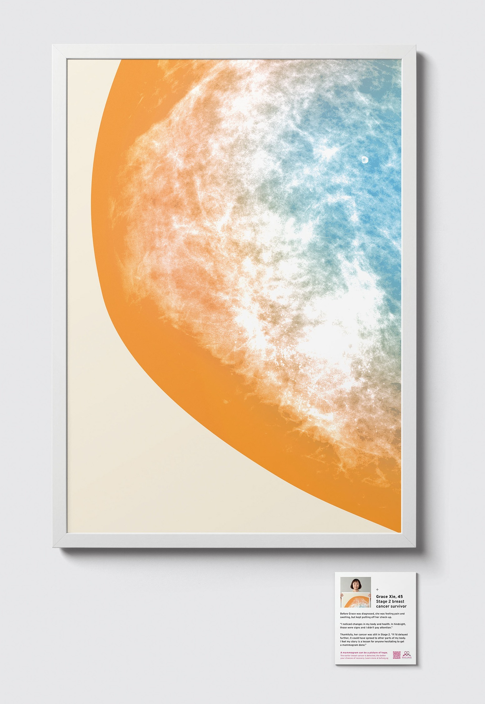
Which brings us back to 2022 and the mysteriously wordless introduction art. This piece is part of a larger project called “MAMMO” by Thomas Yang and the Break Cancer Foundation in Singapore which demonstrates the high emotional tenor of art in public health, but also how art evolves along with our health concerns. Unlike tuberculosis and AIDS, breast cancer doesn’t spread between people, so public health solutions no longer focus on fixing externalities or stopping infectious behavior. Cancer prevention faces a different challenge: people must act today to prevent a disease in the distant future.
Why is this hard? In an earlier series, I answered, “Why is it hard to stick to good choices?” When the Big Bad thing is far in the future, we tend to “discount” it in today’s choices, particularly if the good choice is unpleasant. Much of our chronic disease burden stems from today’s poor choices—driven by how easily we discount the future. Cheap and easy fast food wins out over cooking; Netflix and the couch win out over a walk after a hard day. For women at risk of breast cancer, a cold, uncomfortable mammogram today often looms larger than its possible benefits. Patients underestimate the future benefit of early cancer detection and overweight the negatives of preventive action, which is uncomfortable at best, and, for many, scary and foreign.
The “MAMMO” art campaign addressed the hurdles to prevention in three ways. First, it transformed black-and-white mammograms which detected tumors of breast cancer survivors into the colorful, beautiful art print here for public exhibition. This recasts today’s choices with a warmer, pleasant feeling about the mammogram itself. Second, stories of hope from the survivor accompanied the prints, amplifying the emotional weight of the future benefits of prevention. Finally, coming full circle in public health’s use of art, the exhibit displayed QR codes throughout where women could easily make appointments for a screening—emotional pull, information, and changes in behavior!
What's the most memorable art you've seen in a public health campaign?
Best,
TMD
Special thanks to one of the WFU’s freshly minted Economics grads,
, for her great work contributing to this post.If I could sum up 2020 in one word, it would be: externalities. Read more here about Rock concerts, Amazon, and the benefits of gossip! Or read here about crushing our goals during flu season and information as the best medicine.
If you’d like to read more about the evolution of public health posters, Imagining Illness : Public Health and Visual Culture, has many interesting stories. (Check out Chpt 9 in particular). Edited by David Serlin, University of Minnesota Press, 2011.